The L’Aquila earthquake – Could have known better?

It took a while until I got the December issue of “Significance” shipped and finally got some time to read it, but the article from Jordi Prat “The L’Aquila earthquake: Science or risk on trial” immediately caught my attention. Besides the scary fact that you may end up in jail as a consulting statistician, it was Figure 1, which struck me:

Reproduction from Figure 1

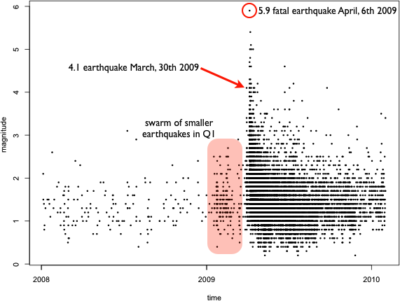
Even as a statistician who always seeks exploration first, I was wondering, what a simple scatterplot smoother would look like that estimates the intensity, and whether or not it would be an indicator, of what (might have) happened.

Spline estimate of average magnitude

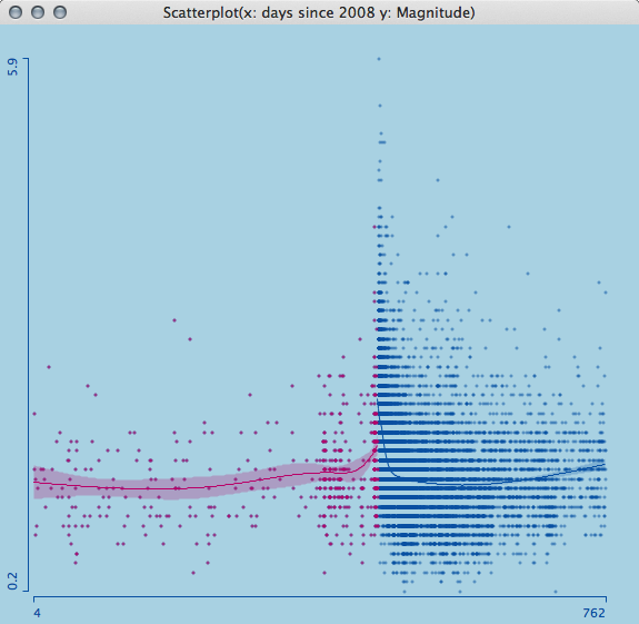
Looking at a smoothing spline with 4 degrees of freedom, separately for all the measurements before and after the earthquake, we see a sharp rise and a narrowing confidence band before April 6th 2009. As I am not a geologist, I can only interpret the raw data in this case, which I think should have alerted scientists and officials equally.

Naturally, we are always wiser after the event actually happened, so let’s look at the estimate (I use a loess-smoother with 0.65 span here) we get three week, one week and one day before the disastrous earthquake on April 6th.

Three estimate with varying horizon

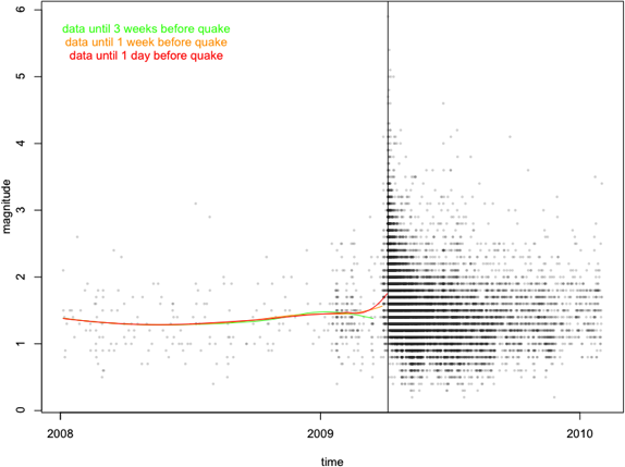
Whereas three weeks before the quake things seem to calm down again, one week before the quake, the smoother starts to rise not only due to the 4.1 magnitude quake on March 30th. One day before the disaster, the gradient goes up strongly.

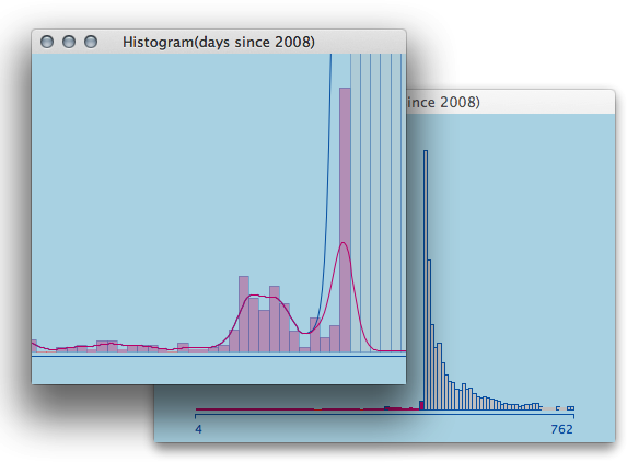
A simple zoom-in on a histogram supports the fatal hint on an apparent slow down in activity a few weeks before the earthquake.

A Histogram of Earthquake activity

Let me stop speculating here, but it let’s me rest more assured (as a statistician) as relatively simple data and methods do show that a stronger event might have been quite close on the evening of April 5th 2009.

I got the data from the Italian Seismological Instrumental and Parametric Data-Base and it can be accessed here. There are many articles on the web regarding the case and conviction – I only want to point here for further discussion.


Global Warming: Causality vs. Timeframes

The weather channel wetter-online pointed me to the latest global temperature anomalies which made me think about this post. Everybody knows that worldwide temperatures are rising. Rising as well does the concentration of CO2, which is literally fueled by burning fossil fuels. Ok, here goes the proof that rising CO2 levels correspond to rising temperatures:

Temp vs. CO2 for 1970 to 2000

As CO2 is the “most famous” greenhouse gas and thus causes temperatures to rise, the whole thing fits – at least for the timeframe we are looking at, which is 1970 to 2000. (OK, putting the two quantities on selected separate scales is a bit cheesy, but this is how media will sell these topics to us …)

Looking at the temperatures from 1880 to 2013 alone, gives rise to new questions when we look at the last decade:

Global Temperature 1880 to 2013

Looking at the smoothing spline for the monthly data, we see that global warming has stalled for almost a decade now – temperatures even seem to fall slightly.

From the first plot we know that CO2 concentration rises steadily, even in the last decade. So let’s take a look at the correlation between global temperatures and CO2 concentration.

Global Temperature vs CO2 concentration

A simple linear regression for the years 1953 to 2003 (red dots) supports the causal relationship, and is supported with an R2 of 0,61. Temperatures rose roughly 0.01 degrees centigrade per 1 ppmv. This was an easy to use model, which leads to apocalyptic temperatures when being projected some decades to the future, as CO2 concentration rises roughly 2ppmv per year right now.

Looking at the timeframe of 2003 to 2013 (green dots), the linear trend is slightly negative with an R2 of 0,005, which leads to the conclusion that CO2 does not really have an influence on the global temperatures right now. Brushing over an arbitrary decade shows, that this change is really unique since the mid 60s:


But what is the conclusion now? Is the whole CO2 story bogus? The answer is a clear maybe. Doubtlessly, it is stupid to burn the very limited resources of fossil fuels at the rate we are doing right now – especially after fracking became the salvation for all global energy problems. There is no way around using regenerative energy sources which are CO2 neutral and thus are no threat to the climate.

Do we fully understand the changes in global climate? A clear “No”. The timeframes we are looking at for which we have reliable data is so small compared to the timeframe global climate changes occur, that it is hard to derive final conclusions from what happened in the last decades. Nonetheless, we can stop doing stupid thing, and e.g. sell our gas guzzling SUV tomorrow!

(Thanks to D Kelly O’Day’s blog at http://chartsgraphs.wordpress.com which was inspiration and guide to data as well. The data are taken from GISS and NOAA.)

Understanding Area Based Plots: Trellis Displays

This is the third and last post on area based plots. Area based was certainly true for tree maps and mosaic plots, but falls a bit short for trellis displays, such that the term “grid based” would be more suitable. Nonetheless, all three plot types use conditioning within their core definition and the layout of the plot elements is more or less done on a grid such that a similarity is clearly given.

The use of trellis displays (users of R will know them as lattice graphics) was invented by Bill Cleveland in the early to mid 90’s. First as so called co-plots, and later on as Trellis Displays within the S-Plus package.
The basic idea is pretty simple. We use categorical variables to systematically condition the plot we want to look at in the first place. Let’s look at an example:
Scatterplot MPG vs. 0-60
This first plot is nothing more than a scatterplot for the cars data I already used in a previous post. The trellis display now conditions the plot according to the car type:
A trellis display conditioned by car type
The plot make all the more sense when we add an estimate a functional relationship for the two quantities. Let’s start with a linear estimate:
A Trellis Display with linear estimate
In general, you could use up to three variables to condition on (one in the rows of the trellis, one in columns and one via colors), and two variables as the so called panel plot, i.e., the plot which is drawn for each conditioned subset.
Above example is rather simple and trellis hardcore user will use this plot type extensively for advanced model diagnostics, but that would be too much for this post.
Personally I would handle above example in an interactive setting which allows to select any subgroup you like:
The data from the trellis plot in an interactive setting
This is what it looks like in Mondrian.

Alpha Transparency explained

Once again the idea for this post was accelerated by a post on the JMP blog published some month ago.
Alpha transparency was quite an eclectic feature in the mid 90s in statistics. I remember Ed Wegman visiting and presenting a video of what they accomplished with alpha transparency in parallel coordinates. The hardware they used was extremely expensive such that he was only able to show that video of some show cases and we were not able to get our hands on the real thing.
By now, this feature is build into MacOS X (since its first release) and Windows (I guess since Vista) and thus extremely cheap to get at. Java does support it for a long time and by now, even R does support it with a simple color argument. Enough for the technical details, lets talk about why we need it in statistical graphics so badly.

The basic idea behind using alpha transparency in statistical graphics is to cure overplotting in cases where a plot has to host tens or hundreds of thousands of single observations. Here is what you get using R’s default on 69,541 ratings of chess players:

Default Scatterplot in R with almost 70,000 points

Apart from the not really well chosen default plot symbol of an ‘o’ (which has been discussed often enough, I guess), the massive overplotting makes it impossible to see any structure within the big black blob. With alpha transparency we can now make the plot symbols semi transparent, such that more ink adds at areas where there are more points. Here is what you get with the default setting in Mondrian:

Default in Mondrian

Now, as with all defaults, they can be well chosen, but in the end, you want to be able to play around with the parameters to generate the maximum insight. There are essentially two parameters to choose:

  1. Point size (or more general, symbol size)
  2. Transparency

Obviously, the bigger the point, the worse the overplotting, which in turn can be cured with increased transparency. In the end, both parameters correspond to the kernel of a kernel density estimator. Here is what you get when you change the defaults in the above plot from 3 -> 5 pixel point and reduce opacity from 1/8th to 1/30th.

Scatterplot with 5 pixel points and alpha=0,03

Now there is even more clearly to see, that there are hardly any ratings below 2,000 before 1985 – does anyone know the background here?

Let me end with another nice example; the so called pollen data from an old ASA data exposition in the 86. The data has the word “EUREKA” ‘implanted’ into the center of highest density. There is clearly no chance to find this feature with purely numerical methods, if you do not know what you are hunting for beforehand. With a good default setting, you will get an idea immediately:

The pollen data in Mondrian's default plot setting

There is a dense string visible in the middle of the plot, and a simple zoom into the plot shows us what we got:

A simple zoom shows the word

Here is how you do it in a short movie (mouse clicks and key presses annotated)


And of course, there are also two lines of code in R for the initial chess rating example, for those who do not want to get stuck with the default plot settings:

> Chess <- read.table("/Users/.../ChessCorrNA.txt",header=T,sep="\t",quote="")
> plot(Chess$Geburtsjahr, Chess$Rating,
  col=rgb(0,100,0,3,maxColorValue=255),
  pch=16)

Oh, btw Happy New Year!

Fuel Economy: Multiple Scatterplot Smoother

I once in a while stop by at the JMP blog, and I was surprised to find tools and techniques implemented in JMP, which I built into Mondrian in the early 2000s. In the post “Visualization of fuel economy vs. performance“, we find a showcase of using multiple smoothers in a scatterplot for acceleration versus fuel economy.

Before discussing the smoothing issues, lets take a look at the dataset. The data can be found at the Consumer Union’s website, and lists basically only 0-60 mph acceleration and fuel efficiency for 168 cars, along of with a classification of the car type. As Mondrian offers the ability to show graphical queries, which pull images directly from the web, I also added a column containing links to images of the cars. Here is an example for the Chevy Volt:

We immediately see two very efficient cars – compared to the rest of the cars – which is the Chevy Volt and the Nissan Leaf. As the examples on the JMP blog leave these two cars out, I chose to do the same. Here is what a smoother for all remaining cars looks like.

Unfortunately, the post on the JMP blog does not tell us which smoother they actually use, but if you compare my result with the first scatterplot in the post, you find quite some differences. Not in the general result, which is better acceleration reduces mileage (what a surprise …), but in the detail interpretation. Whereas the smoother on the JMP blog is quite bumpy, the loess smoother suggest an almost linear relationship except for the range between 20 and 30 mpg, which does not change much even when we change the smoothing parameter.

Finding adequate and comparable smoothing parameters is the challenge when showing smoothers for multiple groups (usually of different sizes). For this example, I chose spline smoothers, which also allow to plot a confidence band around the smoothing estimate.

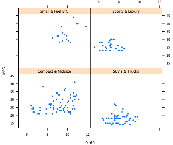
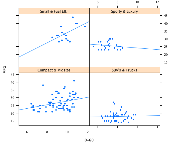
The example shows natural smoothing splines with 1 df. As the groups differ in size and support along the x-axis, the degree of smoothing looks quite different and somewhat inhomogeneous; which usually should not be the case.

Talking to experts in the field, they only shrugged their shoulders when I asked them, how to find compatible smoothing parameters for different sample sizes.

Btw, the problem was solved on the JMP blog quite elegantly by using linear fits, i.e. no smoothness at all 😉

Less is More

Programming a VCR was the classical example of failed user interfaces. Given that the only thing that we need to specify for recording a show on a VCR is the starting date and time as well as the running time, it is hard to believe that it is really that hard.

As summer finally seems to be over now, I found myself switching off the automatic water timer, which helped growing tomatoes and zucchinis to unprecedented size and yield.

Looking at the tool, I was once again surprised, how simple and effective the interface is, which the manufacturer choose to program this watering computer.

Instead of letting the user wander through menus on a (too) tiny LCD screen, there is only one central dial, which can set

  • time of day
  • starting time
  • frequency, and
  • duration

For each function, there is a button to confirm the setting, and you are done. A simple color coding tells you which scale belongs to which function/button.
You are thus not able to set the watering to 5 times a day for 8 minutes each – but watering every 6 hours for 10 minutes will dispose the same amount of water.

I chose a similar approach of limited but explicit choice for selecting bin width and anchor point of histograms in Mondrian. Instead of giving the user the (apparent) freedom of choice, Mondrian prompts the most common values one would choose for data on that scale – and in the vast majority of all cases the desired bin parameters can be choosen directly from the menu.

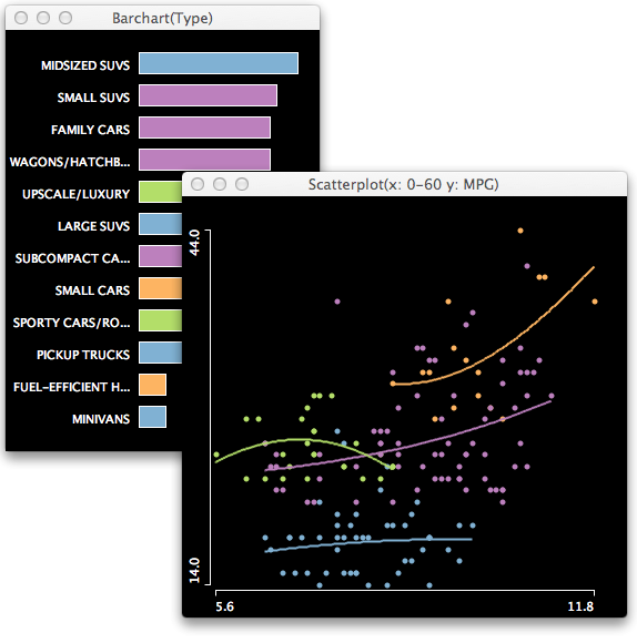
In cases where some odd value needs to be specified, the “Value…” option does the job – and, btw, doing it interactively is of course even nicer …

(For those who have a hard time with the above interface here is further advice)

(Some) Truth about Big Data

I read the President’s Corner of the last ASA Newsletter by Bob Rodrigez the other day and had some flashback to times when statistics met Data Mining in the late 90s. Daryl Pregibon – who happened to be my boss at that time – put forth a definition of data mining as “statistics at scale and speed“. This may only be one way to look at it, but it shows that there is certainly a strong link to what we did in statistics for a long time, and the essential difference may be more along the technological lines regarding data storage and processing. Bob does phrase exactly the same thing for Big Data 15 years later, when he says “statisticians must be prepared for a different hardware and software infrastructure“.

Whereas the inventors and promotors of the new buzz word Big Data even create a new profession, called “Data Scientist”, they are largely lacking ideas which can describe their conceptual activities (at least ones, which we didn’t use in statistics for decades …).

Let me try to put Big Data into perspective by contrasting it to statistics and Data Mining:

Whereas statistics and data mining usually deal with fairly well structured data, big data is usually more or less unstructured. Classical statistical procedures were based on (small) planned samples and data mining input was usually derived from (large) transactional sources or remote sensing. Big data goes even further, i.e., collects data at points where we don’t expect someone to be listening, and stores it in immense arrays of data storage (some people call it “the cloud”). Be it the location via mobile phones, visited websites via cookies or “likes”, or posts in the so called social web – someone is recording that data and looks for the next best opportunity to sell it; whether we agree to, or not.

The marketing aspect is even more important for Big Data than for it was for data mining. Quite similar to the US political campaigns, consulting companies like McKinsey publish papers like “Big data: The next frontier for innovation, competition, and productivity“, which tell us, that we are essentially doomed, if we do not react on the new challenge – and btw. they are ready to help us for just a few bucks …

What is missing though, are the analytical concepts to deal with Big Data – and to be honest, there is no way around good old statistics. Companies like SAS create high performance tools, that now can connect to Hadoop etc. and will compute good old logistic regression on billions of records in only a few minutes – the only question is, who would ever feel the need to, or even worse, trusts its results without further diagnostics?


As Good as it Gets

Developing software in academia usually does not lead to commercial products, and if the intention is just this, the academic qualities often fail to reach common standards. Nonetheless, there is always the hope that commercial products might pick up the ideas generated in academic software projects.

Being involved in many software projects on (interactive) statistical graphics over the course of the last 20 years, one was often disappointed about how little was picked up by the commercial counterpart. All the more I was very surprised to find this post on the JMP-blog:

which is quite similar, to what can be found in an older post by me back in 2005 – but here is my current reproduction of the JMP post:

What was even nicer to read was the phrase “…an analysis of the 2005 Tour is featured in the excellent book by Theus and Urbanek titled Interactive Graphics for Data Analysis.” It seems that the JMP developers once in a while take a look at our book and implement the one or the other feature from the book, which you will also (mostly) find within Mondrian – can it get any better?

Tour de France 2012

— That’s it for this year …

After we all recovered from the “shock” that Spanish soccer is still hard to beat (no matter if you are Italian or German …) its time to look into this year’s Tour de France data.

After the first 4 stages passed, I will start to log the results in the usual ways as in 2005, 2006, 2007, 200820092010 and 2011 now:

Stage Results cumulative Time Ranks
Stage Total Rank
(click on the images to enlarge)

– each line corresponds to a rider
– smaller numbers are shorter times, i.e. better ranks
– all stages are on a common scale,
– stage-results and cum-times are aligned at the median, which corresponds to the peloton

STAGE 4: still 45 riders very compact, but hey – a German winner …
STAGE 5: almost no change in the classement
STAGE 6: a massive pile up of dozens of riders cuts the leading group by half
STAGE 7: not CANCELLARA’s day, he gave the jersey to WIGGINS for now …
STAGE 8: RADIOSHACK-NISSAN now the leading team.
STAGE 9: again a strong performance of WIGGINS, but the mountains will tell …
STAGE 10: a group of 5 makes the day, but can’t challenge the yellow jersey
STAGE 11: quite some shake up in the ranks, but no surprises at the top
STAGE 12: team RADIOSHACK with 4 riders in the top 15
STAGE 13: no changes in the top 15 for two stages now
STAGE 14: as neither the top 15 nor flop 15 change, its time to look at the drop-outs
STAGE 15: the small group of 6 breakaways can’t change the field
STAGE 16: VOECKLER’S day, but nobody to stop WIGGINS
STAGE 17: The leaders make the day; only 2 stages left
STAGE 18: Jan GHYSELINCK’S mysterious reentry of the Tour …
STAGE 19: WIGGINS faster than ever – how come?
STAGE 20: The trace of the winner – the first British ever.

For those who want to play with the data. The graphs are created with Mondrian.

There is a more elaborate analysis of Tour de France (2005) data in the book.

Of course – as every year – a very big thanks to Sergej for updating the script!

The Good & the Bad [6/2012]: Euro 2012 Statistics

This one is almost too bad to present, but I could not resist:

The pie chart shows the number of spectators for the past european soccer championships of the last 50 years – in a pie chart (found on an insert of the “11Freunde” soccer magazine ).

Now “the Good” is too obvious and thus too easy: a simple time series:

Now that looks like a success story. An almost steadily increasing number of spectators bringing in the base cash flow from ticket sales (there are two hick-ups in 1968 / Italy and 1988 / Germany with extremely high number of fans seeing the matches).

The story behind these number is easy when we look at the number of games played at each of the tournaments:

The system was changed twice in 1980 and 1996 such that far more teams now compete and far more games are played accordingly.

Looking at the number of spectators per game flattens the time series to an almost constant number of roughly 30,000 to 40,000 spectators per game – a number which is almost unchanged for the last 16 years:

There are a several other interesting statistics on the insert, but let’s leave with these figures for now.

Still a long way for the German team to go if they really want to be the champion this time, which I don’t happen to have a good proof for like 2 years ago in the world championship – although I have something (even worse) in mind …

(Sorry for making the graphs in MS Excel, but it was just the fastest …)

Facebook’s Privacy Erosion Strategy Visualized

Today is the IPO of Facebook and many of us are asking ourselves what it is, the prospective shareholders are investing in … The answer is quite simple: “You’re not the customer, you’re the product”

Although I am not a friend of circular visualizations, if the whole thing we look at has no repeating nature, Matt MacKeon‘s visualization of the default privacy settings within Facebook over time shows nicely what is going (wr)on(g):

Evolution of the default privacy settings within Facebook

(click on the image for the interactive version)

Easy to see how the privacy is gradually taken away from the “default” customer. Even those who go to the privacy settings and change the default to more private settings will once in a while be surprised that their settings are back to default, as restructured privacy categories are always set to default even for existing customers.

Let’s close with a nice example of how the customer <-> product reversal usually ends up:

Fundamentals: What’s the story?

In an age where “data is the new oil” (a controversial claim, worth its own post …) there is data everywhere, i.e., data is collected more and more automatically, be it by smartphones, cameras, or social networks sucking up people’s privacy. Having all this data at hand, opens up the possibility to visualize things we never had a chance to look at before. One (early) example is certainly the “Facebook map“.

Going back to a quote of John W. Tukey – who can be seen as the reviving power of statistical graphics, and thus ultimately of visualization in general – we can learn a bit about the motivation behind graphical data analysis

“… paradigm of exploratory data analysis
a) here is the data
b) what is it trying to tell us; in particular, which question does it want us to ask?
c) what seems to be going on?

Although there seem to be the “data first” aspect in both the classical EDA approach and the modern data visualization, we can find a fine distinction regarding the motivation.

Here are two examples which are dominated by their flashy presentation, but fail to ask the relevant questions and can’t really tell us a story showing what seems to be going on, apart from what we (trivially) knew before.

Snaphots taken on May 1st

This example is taken from the triposo website and shows locations of photos taken with smartphones and logged with the triposo trip advisory application. Whereas this is a cool visualization; what is it trying to tell us? From the comment on the website, we can see how badly the “story” behind the data fails: “This is probably the clearest example of all: Labor Day celebrations light up Europe and China in a big way. Who doesn’t want to take a picture of a nice 1st of May Parade? …” At least in the last 25 years, it was was hard to find a single 1st of May Parade in Europe.

It gets even worse when the visualization actually shows things that are not in the data as in the next example from villevivante.

mobile phone traces in Geneva

Nathan did post this example and finished with “It’s hard to say exactly what you’re seeing here because it does move so fast, and it probably means more if you live in or near Geneva, but speaking to the video itself, you have your highs and lows during the start and end of days.” It is not a particular insight that most of us travel into cities to go to work in the morning and move back out to our home at the end of the day. What is interesting though, is that according to the visualization, people in Geneva do not move along roads, but seem to enter the city like a swarm of bees …

To summarize, a good visualization should (at least) fulfill these requirements:

  1. Be clear about what data was used (especially regarding generalization)
  2. Make sure the visual abstraction does not lead to misinterpretations
  3. Actually tell a story
  4. Answer questions where we didn’t know the answer already