Less is More
Programming a VCR was the classical example of failed user interfaces. Given that the only thing that we need to specify for recording a show on a VCR is the starting date and time as well as the running time, it is hard to believe that it is really that hard.

As summer finally seems to be over now, I found myself switching off the automatic water timer, which helped growing tomatoes and zucchinis to unprecedented size and yield.
Looking at the tool, I was once again surprised, how simple and effective the interface is, which the manufacturer choose to program this watering computer.
Instead of letting the user wander through menus on a (too) tiny LCD screen, there is only one central dial, which can set
- time of day
- starting time
- frequency, and
- duration
For each function, there is a button to confirm the setting, and you are done. A simple color coding tells you which scale belongs to which function/button.
You are thus not able to set the watering to 5 times a day for 8 minutes each – but watering every 6 hours for 10 minutes will dispose the same amount of water.
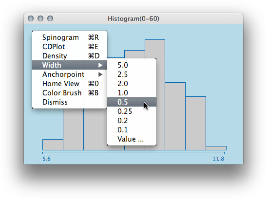
I chose a similar approach of limited but explicit choice for selecting bin width and anchor point of histograms in Mondrian. Instead of giving the user the (apparent) freedom of choice, Mondrian prompts the most common values one would choose for data on that scale – and in the vast majority of all cases the desired bin parameters can be choosen directly from the menu.
 In cases where some odd value needs to be specified, the “Value…” option does the job – and, btw, doing it interactively is of course even nicer …
(For those who have a hard time with the above interface here is further advice)


