Brazil vs. Germany
It is bold to post this after 30 mins in the game, but what can you say …
(Just to make sure, this is just meant as an example for effective visualization 😉 )
It is bold to post this after 30 mins in the game, but what can you say …
(Just to make sure, this is just meant as an example for effective visualization 😉 )
After the first 4 stages passed, I will start to log the results in the usual way as in 2005, 2006, 2007, 2008, 2009, 2010, 2011, 2012 and 2013 now:
| Stage Results | cumulative Time | Ranks |
|---|---|---|
 |
 |
 |
| (click on the images to enlarge)
– each line corresponds to a rider |
||
STAGE 4: KITTEL to win his third stage, but still only rank 147
STAGE 5: Two ASTANA riders take the lead
STAGE 6: Yet another german victory, but NIBALI and FUGLSANG still in the lead
STAGE 7: A group of 42 already set apart 3 min, but the mountains are still to come
STAGE 8: After the first hills, KADRI wins and NIBALI can double his lead
STAGE 9: GERMANY got the 4th soccer world cup title – congratulations!
STAGE 10: NIBALI back in the lead with now almost 2:30
STAGE 11: As the classement does not change too much, let’s look at the dropouts
STAGE 12: GALLOPIN is the looser of the day – first mountains to come next stage
STAGE 13: After the first stage in the Alps, the top 16 spread 11’11”
STAGE 14: Anyone to stop NIBALI? Now 4’37” in the lead
STAGE 15: After a transfer stage, we may look at JI’s Chinese contribution …
STAGE 16: A group of 14 set apart, but can not endanger NIBALI’s lead
STAGE 17: MAJKA’s great second half of the tour is pushing him >100 ranks
STAGE 18: And yes, NIBALI wins again …
STAGE 19: NIBALI and JI are the “envelope” of the tour
STAGE 20: MARTIN flies to win the time trial – far from a podium finish in Paris
STAGE 21: Another victory for KITTEL, but we close with the trace of the winner!
Don’t miss the data 🙂
It is nothing new, to see the rise of some populist party right before an election, exploiting some anxiety in the population. With the AfD (Alternative for Germany) it is the easy to activate fear of economical decline, potentially caused by the economical solidarity within Europe. The set-up is simple, with an ever smiling economics professor at the top as some sort of build-in authority for the promoted anti-Euro politics.
To cut a long story short, the AfD almost made it into the german parliament with 4,7%. Recent polls have them now by even 6%.Thus the question must be: “Who did actually vote for this party?”.
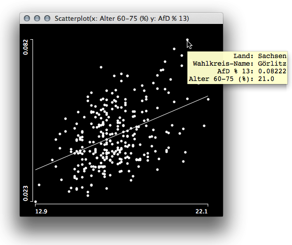
We may want to look at the socio economical data for the last election and hunt for high correlations with the AfD results. Surprisingly, the only variable that shows a decent positive correlation with the AfD result is the percentage of voters between age 60 to 75.
 Interestingly there are far more variables which have a negative correlation and it shows that educations helps – as often the case … With the socio demographic variables not being a good indicator, it is worthwhile to look at the geographical distribution of the election result.
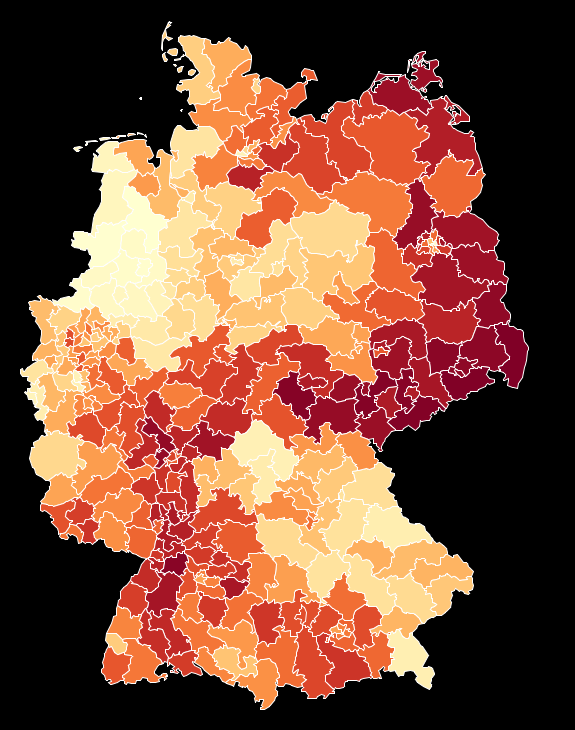
What the map shows is quite surprising, and most people I showed this result so far did doubt that the contiguity of the areas with high AfD results could be “for real”. This upcoming conspiracy theory can be pushed even more when we look at the map, which separates areas above the overall result of 4,7% and below:
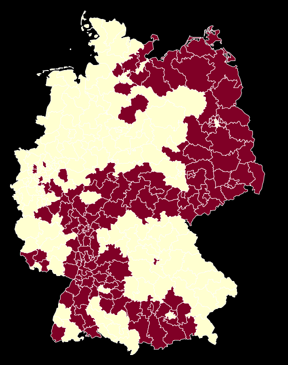
This (fragment of a) shape is too well known in german history (cf. here). But apart from all conspiracies there is a good approximation for these areas by just selecting german states.

This ensemble of plot shows that the strongholds of the AfD are more or less isolated in only 6 states, either motivated by drawing voters from only locally organized right wing groups (like in the east) or attracting voters how are too afraid of loosing their well established “German Gemütlichkeit” by helping out Greece or other troubled EURO-states (like in Baden Württemberg and Bavaria).
If you want to dig deeper, here is the data, map and the software to do so – have fun!
Now its time to show some maps. I won’t go through the usual party maps, as you might have seen them over and over again in TV, newspapers and the web (in fact it is impressing, what you get online by now!).
Instead, I want to look the two losers of the election: FDP and Greens. Here are the maps for the losses for each party. The brighter the yellow, the higher the loss for the FDP and the greener the green (doesn’t this sound lyrical?), the worse the losses for the Greens:

Whereas for the Greens, the losses seem to not only be concentrated on Baden-Würtemberg, for the FDP, the brightest yellow shines in the center of this state.
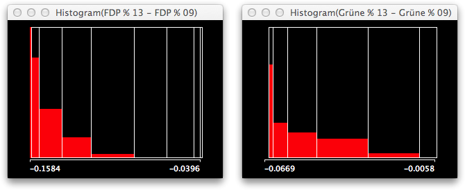
It is even easier to see, once you select only Baden-Würtemberg and look at the histograms of the losses. I put them on the same scale, which again highlights that the “problem” is far worse for the FDP.

The selected voting districts from Baden-Würtemberg clearly are on the left side of the distributions. Once you switch to spineplots, you even better see the conditional distribution of this selected state. As the biggest losses for the Greens are in Berlin, the leftmost bar is not completely highlighted as it is for the FDP.
Given these losses, almost all of the party leaders from the FDP and the Greens quit their office, which to a greater extend can be blamed on the swabian voters …
Stay tuned for the next post, where we look at the AfD, which almost entered parliament, but nobody really knows who did vote for them.
The german reunification is now on its way for almost a quarter of a century. One might think that by now, it might be hard to find the artificial division as a result from WWII, as structural features resulting from centuries of common history might be overruling what was a 40 year political intermezzo.
Not so, when you look at these graphs, based on the 2013 election results and the accompanying socio-economic data:
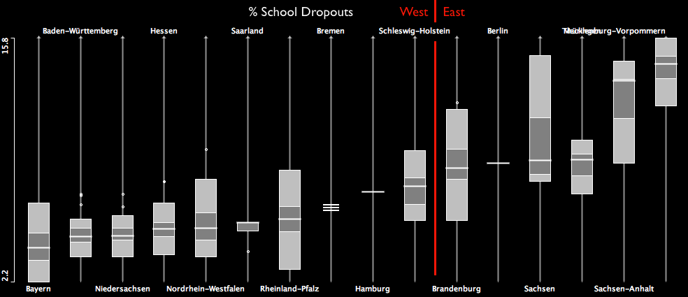
The boxplot shows the quota of people who did not get any school degree. Unfortunately, this measure still divides Germany into two parts.
Not having any school degree also is a good predictor for unemployment, which we can read from the following scatterplot on the left. A bit surprising is, that no matter how badly people are educated, at a certain point unemployment does hardly rise any further – as can be seen from the lowess smoother.

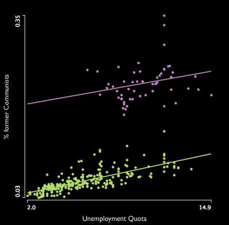
The right scatterplot shows the impact of the unemployment quota on the result of the former communist party (“Die Linke”). Again, we see a strict divide between east and west (even within Berlin). The interesting thing though (which is almost certainly by chance) is the fact, that for each % unemployment, the communists gain 0.5% of votes – no matter wether you are in the west or east. The funny thing is that this party claims full employment, organized by the state, which would make them the worst voting result (using this model 🙂 ).
Stay tuned for the next post, which will show how the small people of the Swabians killed the party leaders of FDP and Greens …
As long as the final results are not yet published by the “Bundeswahlleiter”, I was curious to see how accurate the institutes did forecast the election result. Obviously the last polls were quite a bit off from the final results, and even the initial projections from the first counted voting districts were not too accurate.

Here is the simple visualization for infratest dimap for the CDU/CSU, which is not too different from the other institutes. In the end, being 1-2% off isn’t that bad regarding the prognosis, but is too much if the results are that close as they were last night.
(Thanks to the guys at wahlrecht.de for compiling all the data, and sorry for the bad x-scale from MS-Excel)
Today, Marcel Reich-Ranicki aged 93, died in Frankfurt, Germany. Having survived the Warsaw Ghetto and loosing all his family in German concentration camps, it was all but reasonable to stay in post war Germany and believe in the culture of the “nation of poets and philosophers”. He did, and he did not stop to tell us how to move forward (not only in literature).

His resistless way of criticizing should be an inspiration for all of us and encourage us to name something as “bad” (or even worse) when it actually is. Maybe Robert’s section on criticism of visualizations is a contribution into the right direction and hopefully some of my “Good and Bad” encourage us to move forward by learning from what was not good.
The German election is only four weeks away, so it might be worthwhile to take a look at the historic data from the elections in 2002, 2005 and 2009. Unfortunately, the voting districts are all but stable, such that a direct comparison is not trivial.


The maps show the voting districts, which where won by the either CDU/CSU, SPD or Die Linke (FDP or Bündnis 90/Die Grünen didn’t win any of the districts in the 3 last Bundestagswahlen). The lightest shade indicates “won in one election” … the darkest shade indicates “won in all three elections”.
What we see immediately is:
For the two major parties the messages is thus relatively clear. CDU/CSU should battle to win the north against the SPD, the SPD must battle to win the east from Die Linke.
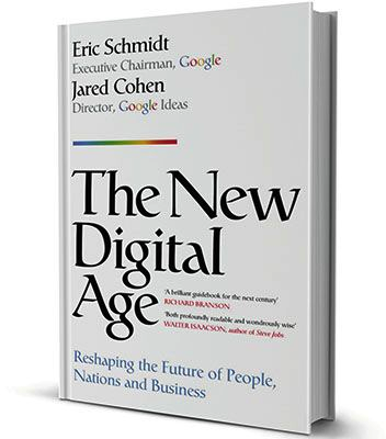 You might ask yourself what the book of the Google chairman Eric Schmidt has to do on a statistics blog. Well, Google’s success was based on doing the “right statistics” on the “right data” at the “right time”.
And not to mention Hal Varian (Google’s Chief Economist) who said: “I keep saying the sexy job in the next ten years will be statisticians.”
In the end, Google makes its money with (our) data, and that’s the stuff statisticians used to analyze and visualize on.
But let’s take a look what’s actually inside:
The book consists of 7 chapters, each telling us something on the future of something – ranging from “Our Future Selves” over “The Future of States” to “The Future of Reconstruction”.
“Our Future Selves” is like a science fiction story, which would be fun to read, if it weren’t for the business case Google already has in mind. The reader should decide for himself/herself whether he/she likes to wear shoes that vibrate when you should get up from breakfast and go to work, or “drive” a driverless car, which optimizes its routes to work automatically. After all, humans are amongst other things special because they can acquire knowledge and skills, which in Schmidt’s future will be obsolete as machines and algorithms will take over.
I was a bit reminded of Jacques Tati in “Mon Oncle”, perfectly alienated, getting lost in the optimized and engineered world of aspiring post war France:
It is hard to argue with Schmidt when it comes to all the changes in politics and society in general, caused by “being connected”. These changes will happen (btw. the word “will” is the most frequently used word in this book, more often than in any apocalyptical scripture in the bible), and are here to stay.
But from a data perspective there is more at stake. The NSA scandal showed what happens when organizations and companies go haywire with our data, and the buzzword “big data” also called statisticians on the plan. There are limits that need to be respected; limits that also limit the stock market price of Google – something we need to keep in mind, when we read Schmidt’s book.
Making Movies is not only the name of an album by Dire Straits, but also the invitation of the ASA Statistical Graphics Section to enter the video competition. You might find the link a bit late (where I can’t dispute, but most creatives prefer to deliver “last minute”, so there is probably still some time left …) but it is actually not the direct reason for this post.
Inspired by the video competition, Antony sat down and actually created not one but three movies of interactive graphics in action – not intended to go into the competition but to motivate others to either use these methods or to create their own case study videos:
1. Titanic
(here is the data)
2. Decathlon
(here is the data – thanks to the excellent decathlon site)
3. Tour de France 2013
(here is the data – make sure to double click times tagged with a barchart to convert them to continuous variables when using Mondrian)
If you feel inspired by what you see, or have your own case study you want to present in Mondrian, go capture your screen and post it via, e.g., DropBox. The best movies will be added to the Mondrian video library and rewarded with a signed copy of “Interactive Graphics for Data Analysis – Principles and Examples“.
If you don’t feel like your own movie director, you might still probably want to download the data and redo what Antony did …
Welcome to the Tour de France No. 100!
After the first 6 stages passed, I will start to log the results in the usual way as in 2005, 2006, 2007, 2008, 2009, 2010, 2011 and 2012 now:
| Stage Results | cumulative Time | Ranks |
|---|---|---|
 |
 |
 |
| (click on the images to enlarge)
– each line corresponds to a rider |
||
STAGE 6: GREIPEL wins the stage, but he is still far behind
STAGE 7: Still a crowd of 56 riders very close at the top
STAGE 8: FROOME uses the first mountain arrival to grep the yellow jersey
STAGE 9: The last day in the Pyrenees caused 5 of the 16 drop outs so far
STAGE 10: KITTEL to win his second stage, but almost 2h behind FROOME
STAGE 11: Tony MARTIN recovered from the crash and escaped FROOME by 12”
STAGE 12: KITTEL wins his 3rd stage but is far behind FROOME’s yellow jersey
STAGE 13: Amazing what you can do with Clenbuterol … CONTADOR 3rd by now
STAGE 14: The top 10 stays together as the stages in the Alps will finalize the tour
STAGE 15: FROOME’S ride is a bit like that of LANDIS in the 2006 Tour … let’s see
STAGE 16: As there is no change at the top, let’s look at the compact group of last 7
STAGE 17: Can CONTADOR’s team push him over the Alps faster than FROOME’s
STAGE 18: FROOME now 5′ in front after the legendary Alpe-d’Huez stage
STAGE 19: Only a crash can stop FROOME – no change within the top 7
STAGE 20: Another stage with no significant change
STAGE 21: As usual – the trace of the winner (and hey, yet another Stage for KITTEL!)
And not to forget the big thanks to Sergej, who helped with the scripts!
Oh, I almost forgot to give you the data 🙂
This is what I got in the mail some days ago …
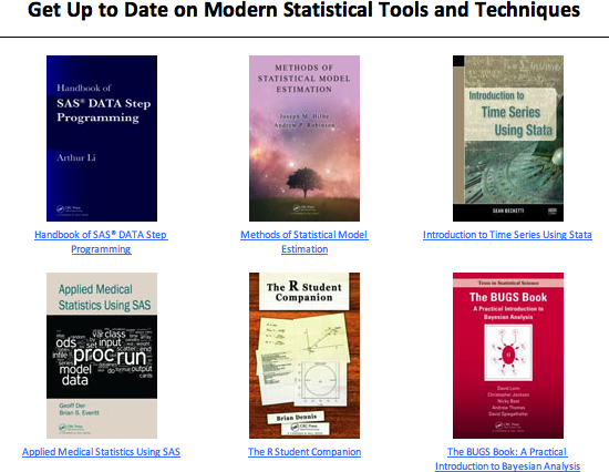
Hmm, if these are the modern statistical tools and techniques, which are the past statistical tools and techniques?
Oh, btw Mondrian turns 15 these days (and I struggle to get version 1.5 finished) … which makes it almost as modern as R.

![]()
Graphics of Large Datasets:
Visualizing a Million

Numbers Rule Your World:
The Hidden Influence of Probabilities and Statistics
on Everything You Do
![]()
Interactive and Dynamic Graphics for Data Analysis:
With R and GGobi (Use R)