Well, R is definitively here to stay and made its way into the data science tool zoo. For me as a statistician, I often feel alienated surrounded by these animals, but R is still also the statistician’s tool of choice (yes, it has come to age, but where are the predators ..?)
What was usually a big problem for us statistician, was to get our methods and models out to our customers, who (usually) don’t speak R. At this point Shiny comes in handy and offers a whole suite of bread and butter interface widgets, which can be deployed to web-pages and wired to R functions via all kinds of callback-routines.
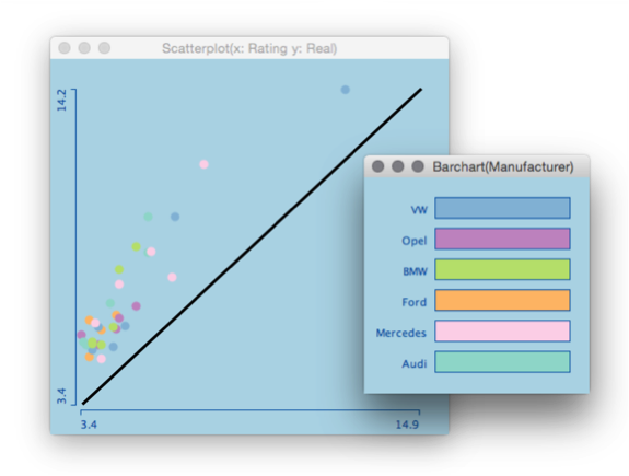
A typical example (sorry for the data set) looks like this:
(Please use this example in class to demonstrate how limited k-means is!)
Hey, this is already pretty interactive for what we know from R and all without messing around with Tcl/Tk or other hard to manage and hard to port UI builders. But what struck me was to try out and see what can actually be done with “real” interactive graphics as we know from e.g. Mondrian and in some parts from Tableau.
Here is what I came up with (same data for better recognition ;-):
The whole magic is done with these lines of code:
library(MASS)

options(shiny.sanitize.errors = FALSE)

options(shiny.fullstacktrace = TRUE)

ui <- fluidPage(title="Shiny Linking Demo",
                fluidRow(
                  column(5,
                         plotOutput("plot1",
                                    click = "plot_click",
                                    brush = brushOpts("plot_brush"),
                                    width = 500,
                                    height = 500
                         )),
                  column(5,
                         plotOutput("plot2",
                                    click = "plot2_click",
                                    width = 500,
                                    height = 500
                         ))),
                fluidRow(
                  column(5,
                         plotOutput("plot3",
                                    click = "plot3_click",
                                    brush = brushOpts("plot3_brush"),
                                    width = 600,
                                    height = 400
                         ))
                )
            )

server <- function(input, output, session) {
  keep <- rep(FALSE, 150)
  shift <- FALSE
  old_brush <- -9999
  var<- 1

  keeprows <- reactive({
    keepN <- keep
    if (!is.null(input$plot_click$x) |  !is.null(input$plot3_click$x))
      keepN <- rep(FALSE, 150)
    if (!is.null(input$plot_brush$xmin) ) {
      if( old_brush != input$plot_brush$xmin ) {
        keepN <- brushedPoints(iris, input$plot_brush,
                               xvar = "Sepal.Length",
                               yvar = "Sepal.Width",
                               allRows = TRUE)$selected_
        old_brush <<- input$plot_brush$xmin
      }
    }
    if (!is.null(input$plot2_click$x) ) {
      keepN <- pmax(1,pmin(3,round(input$plot2_click$x))) == as.numeric(iris$Species)
      session$resetBrush("plot_brush")
      session$resetBrush("plot3_brush")
    }
    if (!is.null(input$plot3_brush$xmin) ) {
      if( old_brush != input$plot3_brush$xmin ) {
        var <<- round((input$plot3_brush$xmin + input$plot3_brush$xmax) / 2 )
        coor_min <- min(iris[,var]) + input$plot3_brush$ymin * diff(range(iris[,var]))
        coor_max <- min(iris[,var]) + input$plot3_brush$ymax * diff(range(iris[,var]))
        keepN <- iris[, var] >= coor_min & iris[, var] <= coor_max
        old_brush <<- input$plot3_brush$xmin
      }
    }
    if( is.null(input$key) )
      keep <<- keepN
    else {
      if( input$key )
        keep <<- keepN | keep
      else
        keep <<- keepN
    }
    return(keep)
  })

  output$plot1 <- renderPlot({
    plot(iris$Sepal.Length, iris$Sepal.Width, main="Drag to select points")
    points(iris$Sepal.Length[keeprows()],
           iris$Sepal.Width[keeprows()], col=2, pch=16)
  })
  output$plot2 <- renderPlot({
    barplot(table(iris$Species), main="Click to select classes")
    barplot(table(iris$Species[keeprows()]), add=T, col=2)
  })
  output$plot3 <- renderPlot({
    parcoord(iris[,-5], col=keeprows() + 1, lwd=keeprows() + 1)
  })
}

shinyApp(ui, server)
What makes this example somewhat special is:
- It does not need too much code
- It is relatively general, i.e. other plots may be added
- It uses traditional R graphics off the shelf
- It is not too slow
Of course it is a hack! But it proves that Shiny is capable to do interactive statistical graphics to some degree.
Something the developer of Shiny actually do think about.