Alpha Transparency explained
Once again the idea for this post was accelerated by a post on the JMP blog published some month ago.
Alpha transparency was quite an eclectic feature in the mid 90s in statistics. I remember Ed Wegman visiting and presenting a video of what they accomplished with alpha transparency in parallel coordinates. The hardware they used was extremely expensive such that he was only able to show that video of some show cases and we were not able to get our hands on the real thing.
By now, this feature is build into MacOS X (since its first release) and Windows (I guess since Vista) and thus extremely cheap to get at. Java does support it for a long time and by now, even R does support it with a simple color argument. Enough for the technical details, lets talk about why we need it in statistical graphics so badly.
The basic idea behind using alpha transparency in statistical graphics is to cure overplotting in cases where a plot has to host tens or hundreds of thousands of single observations. Here is what you get using R’s default on 69,541 ratings of chess players:
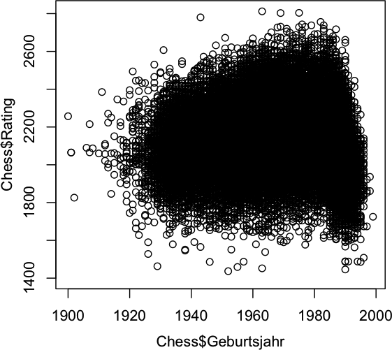
Apart from the not really well chosen default plot symbol of an ‘o’ (which has been discussed often enough, I guess), the massive overplotting makes it impossible to see any structure within the big black blob. With alpha transparency we can now make the plot symbols semi transparent, such that more ink adds at areas where there are more points. Here is what you get with the default setting in Mondrian:
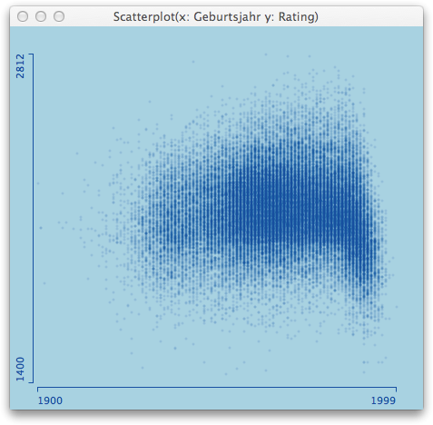
Now, as with all defaults, they can be well chosen, but in the end, you want to be able to play around with the parameters to generate the maximum insight. There are essentially two parameters to choose:
- Point size (or more general, symbol size)
- Transparency
Obviously, the bigger the point, the worse the overplotting, which in turn can be cured with increased transparency. In the end, both parameters correspond to the kernel of a kernel density estimator. Here is what you get when you change the defaults in the above plot from 3 -> 5 pixel point and reduce opacity from 1/8th to 1/30th.
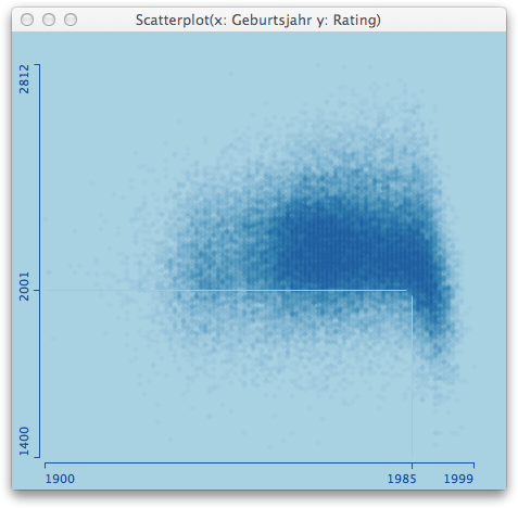
Now there is even more clearly to see, that there are hardly any ratings below 2,000 before 1985 – does anyone know the background here?
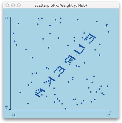
Let me end with another nice example; the so called pollen data from an old ASA data exposition in the 86. The data has the word “EUREKA” ‘implanted’ into the center of highest density. There is clearly no chance to find this feature with purely numerical methods, if you do not know what you are hunting for beforehand. With a good default setting, you will get an idea immediately:
There is a dense string visible in the middle of the plot, and a simple zoom into the plot shows us what we got:
Here is how you do it in a short movie (mouse clicks and key presses annotated)
And of course, there are also two lines of code in R for the initial chess rating example, for those who do not want to get stuck with the default plot settings:
> Chess <- read.table("/Users/.../ChessCorrNA.txt",header=T,sep="\t",quote="")
> plot(Chess$Geburtsjahr, Chess$Rating,
  col=rgb(0,100,0,3,maxColorValue=255),
  pch=16)

