The Good & the Bad [02/2015]
Yes, it’s been a while since the last post, but hey – isn’t it a good sign that I presumably do not stumble over too bad graphics every day (or I just might not have the time to write about it …)
This example comes from SAS’s online manual on their Visual Analytics tool. And here it is:
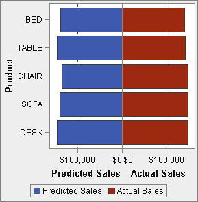
“The Bad” is even supported by explanatory text:
“This example uses a butterfly chart to show the actual sales compared to the predicted sales for a line of retail products. The butterfly chart is useful for comparing two unique values. In this chart, the two values are arranged on each side of the Y axis.“
I am sure that my friends at SAS know better, so I won’t start bashing here, and I will also not start to refine the plot to perfection, as the problem seems to be too obvious:
Why comparing continuous quantities not side by side on the same scale, but put them on separate, opposite scales – especially when we look at quite small differences?
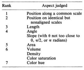
Maybe the programmers of SAS VA or the writers of this online help are too young, so they might have missed Bill Cleveland’s “The Elements of Graphing Data” from 1985, but they could have stumbled over this 1985 paper (available on todays internet). This paper is an essence of what the book talks about in all of Chapter 4 “Graphical Perception”, which has not changed the last 30 years (which can not be said about Figure 3.84 on page 216 ;-).
So here is Cleveland’s advice on the precision of perception tasks:
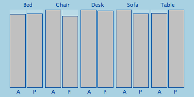
And here is the same data on a comparable scale – I hardly dare to call it “The Good”:
If someone supplies the ggplot “solution”, please feel free to comment and I will add it to the plot.


I agree with your point when talking about small differences but “the Bad” can be quite illustrative and better looking (butterflyie!..) than “the Good” when big differences occur.
I once saw a graphic comparing UK salaries repartition between men and women in different business sectors and the butterfly was clearly unbalanced. The good solution will also show these gaps but I would be less graphically “shocking”. That’s psychological I think.
Using ggplot, there is the system of dodge bar chart :
geom_bar(position=”dodge”)
this line is to add after the construction of the graph with ggplot function.