Chicken and Egg Problem: Follow Up
After getting the data together which was used to generate the visualization criticized in this post, it is just fair to prepare a better version. Tom Carden already showed some quick graphs which improve the initial “pie chart“. Note that I only show the 7 most relevant diseases and grouped the rest into one group “Rest” for simplicity.
A typical problem of the initial chart is that it tries to put many views into one single graph – this usually makes interpretation very hard. Looking at the data we can identify four major questions:
- How do the absolute total costs develop over age?
- Which diseases are dominant at what ages, i.e., a relative view?
- What are the shares to pay by the patients, and how do they differ between diseases and change over ages?
- Are the costs per patient much different for the diseases and how do they develop for older patients?
The absolute numbers of patients are only a secondary question here. To answer the four above questions four relatively simple graphs can be used which are easy to create in a simple (?) tool like MS Excel.
Absolute Costs
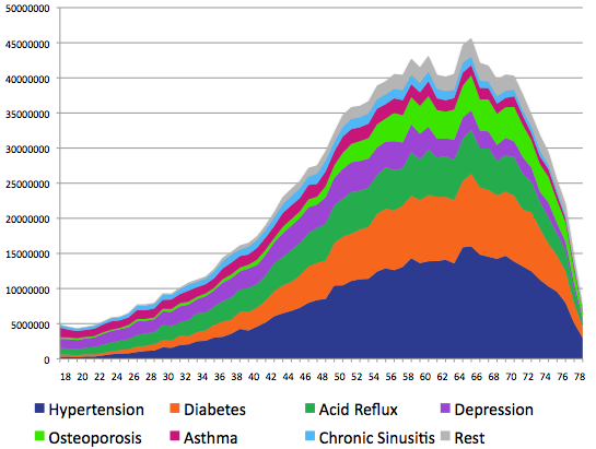
Not much to learn here (which is not better shown in the next chart), except for the fact that whereas Hypertension and Diabetes are almost generating no costs up to age 25, they are the major cost driver around the age of 60.
Relative Costs
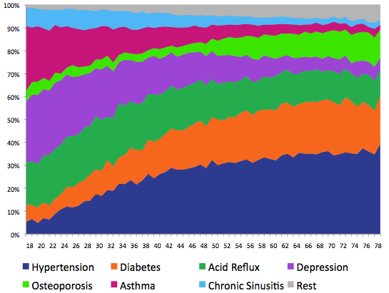
The relative view tells most of the story of the data (of course in conjunction with the absolute plot above). There are basically three groups of diseases:
- Decreasing relative costs:
Chronic Sinusitis, Asthma and Depression - Almost constant relative costs:
Acid Reflux - Increasing relative costs:
Osteoporosis, Diabetes and Hypertension (and Rest)
Share of Personal Costs
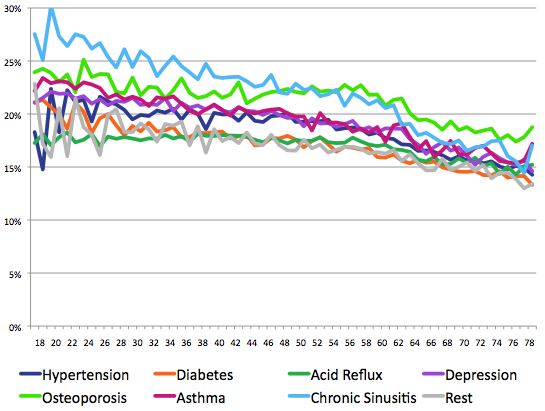
The share of costs for a patient declines from on average roughly above 20% for younger patients to 15% for patients above 70. The share is almost constant for Acid Reflux and Osteoporosis up to age 60, and shows the strongest decline for Chronic Sinusitis.
Average Costs per Patient
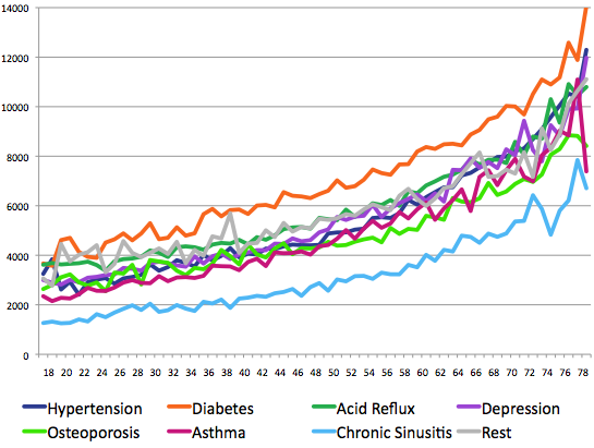
The per patient costs do not show much difference between diseases and increase almost linearly up to age 55. Diabetes is by far the most costly disease whereas Chronic Sinusitis is by far the cheapest. Per patient costs increase sharply in the age range of 70-80 years no matter what disease we look at.
All over all the four graphs are relatively simple and easy to read. They hopefully enable us to get more easily somewhat like a story out of the data.


[…] pointed out how to interpret the original data and produced some first graphs; Martin Theus also provided an analysis. While they both found some first trends, I don’t believe they really got to the bottom of […]