The Good & the Bad [1/2006]
The following figure was taken from:
http://www.forbes.com/2005/09/15/hometowns-networths-america-richest_05rich400_map.html © Forbes 2005
and explained by “Each disk represents one of the 400 richest Americans. They are arranged by hometown, and their size represents the person’s wealth:”
So this is obviously “The Bad”!
The guys who designed this graphics were obviously very ambitious to get as much information in it as possible. Let’s forget about the different years, what do we have here:
- Different colors for different states (actually meaningless)
- 10 different colors for the wealth ranges (arbitrarily ordered)
- the circle diameters are somehow proportional to the wealth (coding essentially the same as the 10 colors)
- Heights for the number of cases at a certain location (with quirky 3-d effect)
- … and of course the geographic location.
Since I don’t have the underlying data to produce the plot (would be to painful to get it from Forbes website) I can only present a graphics which does better for different data.
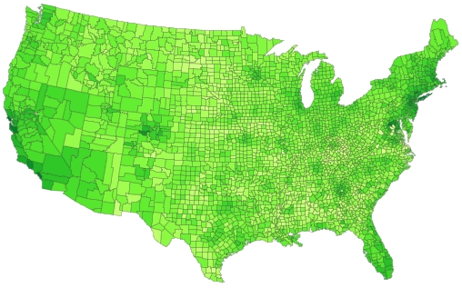
This is a choropleth map on US County level (showing rental prices). Adding the (x,y) coordinates of the actual cities where the millionaires live would be a good idea, too.

