Data Analysis of Yesteryear
It is not too often that a book is published that integrates data analytical methodology and the illustration of the appropriate use of specific tools. When Henk pointed me to the just released “Data Analysis with Open Source Tools” by Philipp Janert, the excitement was big, but it evaporated as soon as I read through the book.
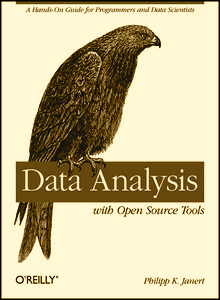
I did start to flip through the pages with Amazon Preview, and was positively surprised that Part I of the book was on “Graphics: Looking at Data” and the following sections were actually progressing in the dimensionality of the data looked at – nice concept, and well copied. The first figure though, is a jittered dotplot – something we were doing in the 70s when we were still sending our plot commands to a pen plotter, and were trying to avoid ink soaked holes in the paper – we should know better more than a quarter of a century later.
It takes quite some pages until the book hits the widely used boxplots in the section “Only when Appropriate: Summary Statistics and Box Plots“, and we read “These summary statistics (mean and median, standard deviation, and percentiles) apply only under certain assumptions and are misleading, if not downright wrong, is those assumptions are not fulfilled.” Well, how can a median be wrong?
A surprising highlight can be found on page 68, where Janert absolutely hits the point in the distinction between “Graphical Analysis and Presentation Graphics” – something he seems to have forgotten just 50 pages later.
In the section on multivariate data analysis Janert talks about “Interactive Exploration” and writes “Now I could imagine a tool that allows us to select a bin in one of the histograms and then highlights the contribution from the points in that bin in all the other histograms“. His imagination could come true with a few clicks when he would use the appropriate tools. On page 124, he throws ggobi and Mondrian in the subtly named group of “Experimental Tools“. He claims “I don’t think any of these novel plot types have been refined to a point where they are clearly useful.” Certainly, if you do not use these (novel?) plots – btw. PCPs had their 25th anniversary last year and mosaic plots will celebrate their 30th anniversary this year – you wont see their usefulness. That Janert most likely did not use Mondrian is somehow apparent, otherwise he would not need to imagine a tool that links histograms.
 The last lowlight to present here is the “histogram” in Figure 9.4 on page 202, which is – hey – just a scatterplot; they are not that hard to tell apart.
I hate being so critical, but we should not let someone get away with a book on data analysis published in 2010 bashing what is standard in modern, interactive, graphical data analysis for more than a decade now. Who would consider using Gnuplot for graphical data analysis in 2011?
If you answer above question with “yes”, go buy the book – if not, save the money for a more up-to-date book.
