The Good & the Bad [08/2010]
The last regular issue of “The Good & the Bad” dates back to [11/2006], so it is more than time to post.
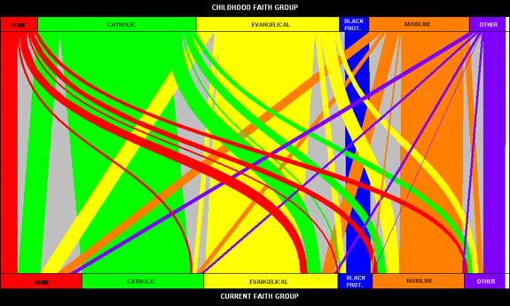
I found this flowchart on Kaiser’s junkchart.

The graph was originally posted on the Internet Monk‘s blog – the data comes from a study, which can be found here. There was no data for this migration matrix posted in either of the blogs, so I reverse engineered the graphics (pixel by pixel) and created the data table.
Although the migration matrix only has 36 potential values to depict (from which some don’t even exist), the flowchart is already tremendously cluttered. The general question, which group loses most is hard to see, and the many small migration paths obscure the graph’s message to some extend.
Here is my suggestion which uses barcharts for source and destination distribution and a fluctuation diagram for the migrations.
What can we read from the graphs? There is a general movement towards “None”, which is by far the biggest receiving group. Both “Catholics” and “Evangelicals” lose substantially, but “Evangelicals” at least gains somewhat from other groups. “Evangelicals” and “Mainline Protestants” seem to be the biggest 2×2 exchange. “Black Protestants” only lose to “None”, which also might just be a data error.


I think the original chart is far superior, as it contains the same information but is much easier to read, in that I only have to follow a line to find out what a colour means, not scan an entire column and decide which of the colours in it matches it. Also: squares are confusing in that one doesn’t know if it’s the area or the length of the sides that is proportional to the value.
“Easier to read” may apply only to a certain aspect of interest. What you can’t easily read from the original flow chart is how the changes distribute over the different destinations, especially those who stay within one denomination compared to those who leave.
Furthermore, only a matrix like layout allows to compare the in- and out-migrations symmetrically, whereas the color coding always has to decide on one direction (independently from the kind of display we are using)
Regarding your comment to areal plots; it’s certainly always the area which is proportional to the values (why else would we be using areas?)
I’m sorry but I have to agree with the first comment. Your attempt is very confusing. I think “easier to read” refers to the principal aspect of interest (at least in my case).
In my opinion Martin’s chart is much clearer and understandable. His approach provides readable information for more than one aspect of the given topic and not only for a certain (principal?) aspect of interest that may vary from person to person. Additionally, the fluctuation diagram combined with the barcharts is better organized than the original chart; therefore it is easier to tell a story around the data for the case that one has to present the results somewhere to a client or at a workshop.