Big Data: Not without my Stats Textbook!
Google is certainly the world champion in collecting endless masses of data, be it search terms, web surfing preferences, e-mail communication, social media posts and links, …
As a consequence, at Google they are not only masters of statistics (hey, my former boss at AT&T Labs who was heading statistics research went there!) but they also need to know how to handle Big Data – one might believe. But with all big companies, there are “those who know” and “those who do”, which are unfortunately often not identical.
So, “those who do” at Google built Google Correlate. A simple tool that correlates search terms. To start with an example (all based in Germany as search term origin), let’s look at what correlates with “VW Tiguan”:
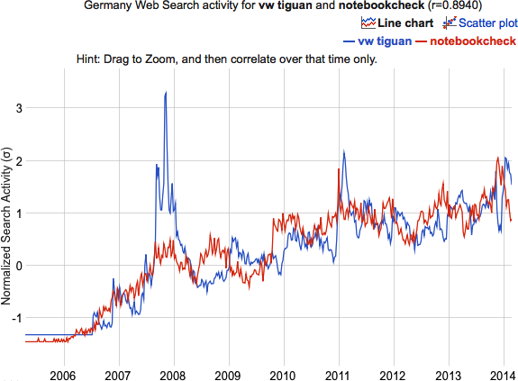
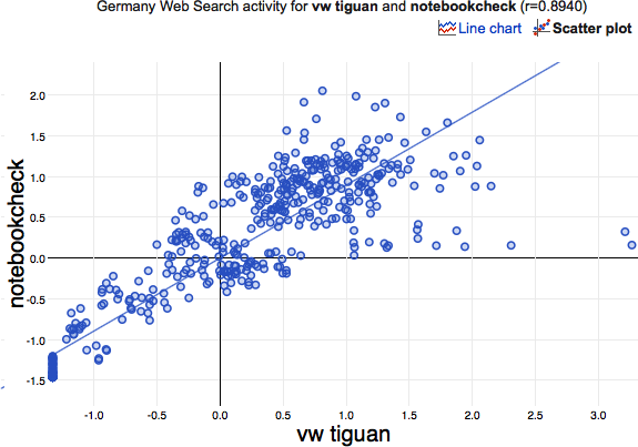
With a correlation of 0.894 it is the forth highest ranking correlation, as I left out “Tiguan” and “Volkswagen Tiguan” as well as “MAN TGX” (which all relate to the term itself or to another car/truck). www.notebookcheck.com is a notebook related website in german language, which is definitely absolutely unrelated to the VW Tiguan. The corresponding scatterplot looks like this:
Besides the general problem of Big Data applications, to make sense out of what we collected, we are facing two major problems to tackle – no matter what kind of data we are actually looking at:
- With millions to billions of records, differences usually all get significant no matter how small they are, when using classical statistical approaches
- The other way round, when looking for similarities, we tend to find things that “behave the same” although there is no causality at all, just by the amount of the data
But what went wrong with Google Correlate? They certainly fell for the latter of the two above listed problems; the question is why? First there is the pseudo correlation (see here for a nice collection of similar causality-free time series), which is solely based on the stationary part of the time series. If you remove the stationary part of the series (I used a simple lowess-smoother) the scatterplot looks like this:
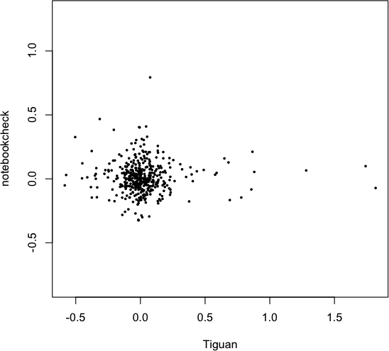
with a correlation of 0.0025, i.e., no correlation. Looking closer a the time series, it is quite obvious, that apart from the stationary component there is no correlation whatsoever.
Enough of Google-bashing now, but the data isn’t iid and a Pearson coefficient of correlation not an adequate measure for the similarity of two time series. In the end, it boils down to a rather trivial verdict: trust your common sense and don’t forget what you have learned in your statistics courses!
(btw. try searching for “Edward Snowden” in Google Correlation – it appears the name has been censored)


A lot of names are missing, e.g. “Jimmy Wales”. Obscure (to me) entertainers are present, such as Ellie Goulding. Obscure, well, secretive hedge fund names, e.g. Two Sigma and D.E. Shaw were also present.
Is there censorship? For Edward Snowden, it seems likely, and at a minimum, quite odd.