Tour de France 2010 Statistics Art Gallery
Sometimes the title may promise more than the post can hold … but I still try my best. As you might know, there is the usual visualization of the stage times, total times and ranks of all riders in the regular post to start with.
As we have more data on the Tour and riders, it is fun to look at these data as well:
Lets first look at the different types of riders and how they performed:
Total Time by Type of Rider
Note that smaller numbers in the boxplots of the total time by Type of Rider correspond to shorter times and better performance. Obviously the classification is quite accurate. The ordering of the types is not surprising, and given the many hard core mountain stages climbers are definitely in for a good all over all performance.
Type of Rider vs Year of Birth (Age)
Interestingly “Leader and Top Rider” are oldest on average, and less surprisingly you seem to start your career as a “Helper”, try your luck as a “Sprinter” and at some probably get to be more than (only) a specialist.
Team by Type
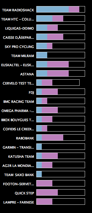
We only highlighted the Leader and Top Rider and Helper here, and sorted after the number of top riders. Team RadioShack really was different, although they won the team classement only by 9′.
Age by Team
Although Team Radioshack is not the oldest on average (actually median), if you look at the Top Riders in the team (highlighted in red), you definitely see that they will need some “fresh blood” the next years – no, I do not refer to doping here ;-).
As we already looked at Age, some more physicals might be interesting:
Result vs Age
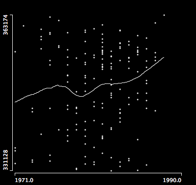
We actually look at year of birth (which is a bit more time invariant than Age). The Tour de France best ager (apart from the older professionals, who “survived” over many years) seem to be around 32, i.e, born in 1978.
There is obviously the correlation between height and weight of the riders, which applies to all of us, such that we rather look at the BMI
Result vs. BMI
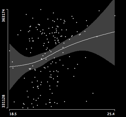
Although the variance gets quite big at the ends of the data range, we see that it is no good to enjoy the good french food and red vine during the tour too much.
Well, the post is already way to long, though there is more to explore here. I can only encourage you to grab the data and play around yourself using Mondrian or some other visualization package – it’s fun.





Hi,
This is a nice analysis. Congrats! I would like to learn mire about the classification that you used here. How did you classify the riders?
We are revising a paper for journal of Sports Economics that you will find on my page and intend to use your classification to improve the predictive power of our model of performance.
Thanks in advance for your cooperation,
Olivier