Understanding Area Based Plots: Trellis Displays
This is the third and last post on area based plots. Area based was certainly true for tree maps and mosaic plots, but falls a bit short for trellis displays, such that the term “grid based” would be more suitable. Nonetheless, all three plot types use conditioning within their core definition and the layout of the plot elements is more or less done on a grid such that a similarity is clearly given.
The use of trellis displays (users of R will know them as lattice graphics) was invented by Bill Cleveland in the early to mid 90’s. First as so called co-plots, and later on as Trellis Displays within the S-Plus package.
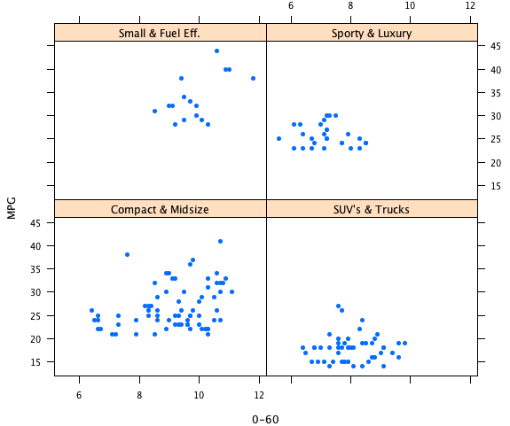
The basic idea is pretty simple. We use categorical variables to systematically condition the plot we want to look at in the first place. Let’s look at an example:
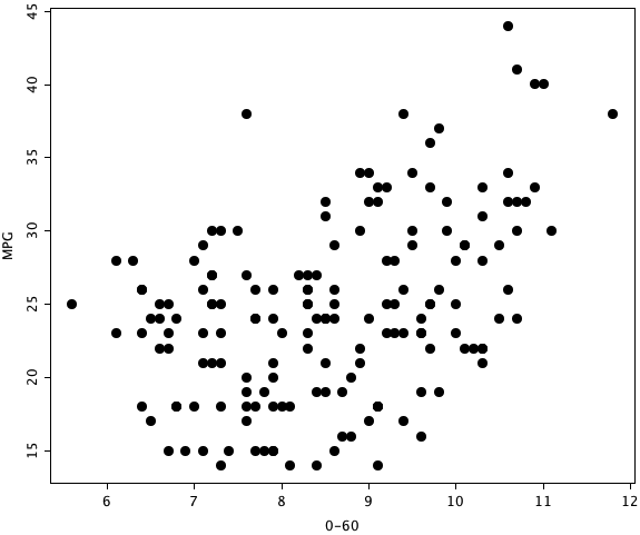
This first plot is nothing more than a scatterplot for the cars data I already used in a previous post. The trellis display now conditions the plot according to the car type:
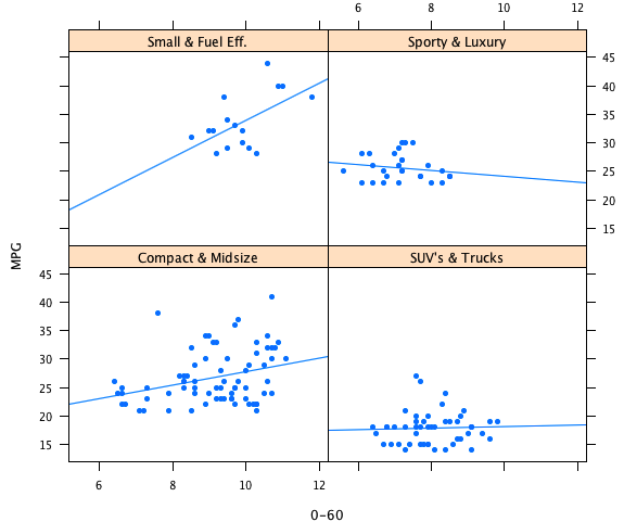
The plot make all the more sense when we add an estimate a functional relationship for the two quantities. Let’s start with a linear estimate:
In general, you could use up to three variables to condition on (one in the rows of the trellis, one in columns and one via colors), and two variables as the so called panel plot, i.e., the plot which is drawn for each conditioned subset.
Above example is rather simple and trellis hardcore user will use this plot type extensively for advanced model diagnostics, but that would be too much for this post.
Personally I would handle above example in an interactive setting which allows to select any subgroup you like:
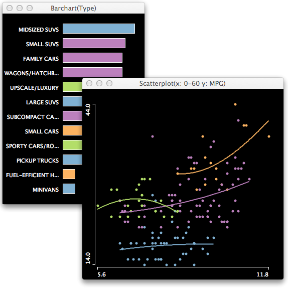
This is what it looks like in Mondrian.

