The Good & the Bad [2/2012]
Looking for a map of the french Departments, I came across this map of the population density of France on Departments level which can be found on Wikipedia – and you may guess: this is this month’s “The Bad”.

At first sight there seems to be a contradiction between the apparently continuous color scale (see here for some thoughts on coropleth maps) and the map that does not seem to give any decent insight in the geographical distribution of population density. The answer is twofold.
1. The color scale is not continuous but has a break between green and blue (unless you invert the shades of blue) and blue and yellow. What we would expect – in less saturated colors – looks like this:

2. For a map showing a continuous quantity, we usually would not choose so many different saturated colors.
Let’s approach “The Good” as I still need to convince you that there might be a better version of the map. In a perfect world, coropleth maps look smooth and “continuous”. For the map of France we might want to look at the distance to the capitol Paris, as France is very centralistic. This map uses a monochromatic scale and shows “the perfect world” …

As this one is obviously too trivial, we want to look at the population density as in the above plot (2011 census data from wikipedia). Using a simple linear scale we would end up with this (useless) map, which uses a color scale that ranges from blue (small values) over white (median values) to red (large values):

Except for Paris and three other departments, all regions are unpopulated compared to the capitol. The extremely skewed distribution which is shown in the lower left, explains the dilemma.
Using the same “trick” as in the original wiki-map, i.e., cutting off all values above 150 we get a map that is easier to read, but now equalizes all information for areas above 150.

(Note, I used the histogram of log(population Density) for the legend)
The result is much better now, but there seem to be too many departments put into a single class.
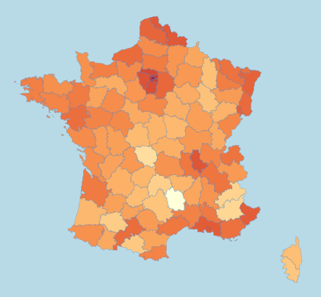
From the data on the log-scale, we already see what would be most desirable, i.e., a distribution of colors, which is close to a normal distribution. Using a non-continuous transformation of the variable we display, we can map the color-shades to be normal, which ends up in the following map, which I would classify as “The Good”.

We now get a fairly good feeling of which regions are highly populated, which ones are close to the median (even with a distinction of being above or below average) and also clearly see the extremely unpopulated departments.
There is a lot more to say about the do’s and don’ts for drawing choropleth maps (which can be found here in Chapter 6). What is even more fun is to play around yourself! Here is the data (unzip and load France.txt with Mondrian) and here is the software – have fun!
(Thanks to Antony for providing the map!)


When a quantity ranges from a small value to a large value, it makes sense to me that it should go from a very light color to a dark color. The color scale used here goes from one dark color through white to another dark color. To me the dark colors at either end signify a lot of something and the white in the middle signifies nothing, but the dark blue really means a lot of nothing and the white means some thing, not nothing. The colors you’ve used are better suited to a two-sided scale, such a caring a lot for one thing to caring a lot for the opposite, going through not caring much at all in the middle.
Jon,
I see your point. If you are just looking at “how much is there”, a monochromatic scheme is usually all you need. Often “a lot of nothing” is as interesting as “a lot of something”, i.e. whenever we need to understand in which cases we find the strongest deviation from the average or median. Then average or median is usually the range of values that is mostly uninteresting. It is just a more “statistical” way to look at it. On a monochromatic scheme it is far harder to tell where these “uninteresting” values are, and even harder to tell larger or smaller values apart.
Here is the mono version for comparison:
Martin
I think it is also very worthwhile to consider the ColorBrewer color palettes from Dr. Cynthia Brewer (Penn State): http://colorbrewer2.org/
Sure, an adapted version of the ColorBrewer schemes can be used in Mondrian for the color coding of categorical data, which will then also apply to maps. I am not a big fan of breaking a continuous variable down into only a few levels – our eyes are capable of much more …
I think a bigger problem here is the choice of the departments as plotting unit. It may be formally necessary for some bureaucratic reasons (that is, the French government works that way), but really population is likely to vary at a much smaller scale. France has numerous cities, and it’s (almost) only because Paris and suburbs get their own departments that you can even tell they’re there.
BTW, it’s been a while since an update to Mondrian, huh?
BTW
http://colorbrewer2.org/
requires Flash.
Huh?
Mondrian 1.5 is in the works. And yes, you are right, I would have like to get all features in by the beginning of this year – stay tuned.
Really nice post. It will be useful in my own work with maps in R. I had Mondrian on my TODO test list for a long time and this post finally made me test it. It is a great tool! Would you know how to create colored histograms (as you have showed in this post) also in R?
Greg,
its pretty easy in R if you color full bars. Like e.g.,
> hist(runif(100), col=c(1,2,3,4))
(you might want to use more meaningful colors though …)
Would need to digg if there is a possibility to color the
individual cases in a histogram.
Martin