The Good & the Bad [12/2011]
This was not meant to be a Good & Bad, but it turned out, that the argument is most effective, when it goes beyond pure criticism and actually offers alternative – so we need a Good.
We find this nice illustration of German energy data at the GE visualization site:
 This kind of visualization is quite common now and had its “initial public offering” with “The Baby Name Wizard” by Martin Wattenberg. The stacked display has some issues (which can make it to “a Bad”) and it takes a careful construction to make sure it is well readable (it actually “only” needs the right stacking order – if there is one). What struck me with above graphics was the fact, that none of the bands is actually aligned at some sort of straight base – typically the x-axis in a plot. As a consequence it is really hard to tell the story behind the data. Most frustrating, the most recent data is extremely jiggling which makes a judgement of the current trend almost impossible.
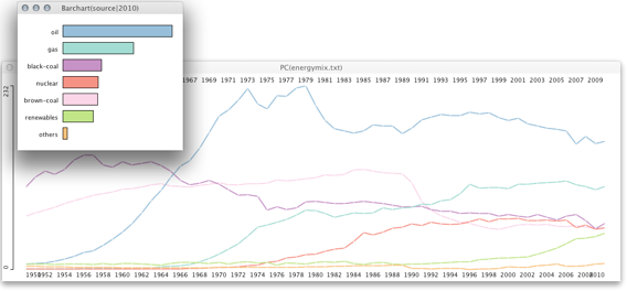
It took me a while to get the data out of the visualization, but you can actually download the whole visualization here. My first attempt to understand the data better was using simple time series which I created by “misusing” a parallel coordinate plot:
 What we lose is the total, as the series are no longer stacked – though, it was quite hard to judge the total in the original visualization as well. The barchart is used as a reference and shows the most recent distribution. What can we learn from this graph:
- Well, there was the oil crisis in 1973 – God knows what would have happened without the crisis stopping this ridicules greed for oil in the early 70s.
- The second oil crisis in 1979 was actually having a real impact, as the decline in oil consumption lasted for four years and since then stayed on a lower level – quite contrary to the crisis in 1973.
- Germany abandoned half of the brown coal sources shortly after the reunification.
- Nuclear energy stalled in 2000 and is now on a (projected) decline.
- Renewable energy sources are the only ones with a significant growth, but it still takes a long way to supersede oil and gas.
- Coal is declining steadily.
You certainly can read off all the topics from the GE-visualization, but you probably would need to know these fact before, which is certainly the wrong way, as a visualization should generate insight and not visualize already existing knowledge.
PS: I tried to find a good stacking order, but after 30min. moving series up and down it looked like there is none.
PPS: There is a quite similar post here


