Big Data Visualization
 … would have been the better title for the book “Graphics of Large Datasets“. As the book was published a few years before the birth of the next buzz word promoted by McKinsey with the white paper “Big data: The next frontier for innovation, competition, and productivity“, we just did not know better.
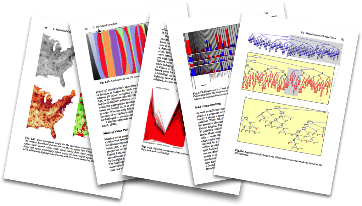
But to be honest, much of the book’s first half – to be precise the first 101 pages – deals with exact with what we generally face when displaying millions of data points / rows / records.
Here is just a small collection of what you have to expect beyond Amazon’s “look inside” feature:
Well, there is certainly one big drawback with this book, as it does not try to simplify things and offer trivial solutions. To cite Albert Einstein:
Everything Should Be Made as Simple as Possible, But Not Simpler
As we deal with really big data, i.e., millions of records, thousands of variables or thousands of models, problems at least need more thought than classical business graphics.
Talking about classical business graphics, in a very modern (i.e., big data compatible) look, we find, e.g., what the guys from Datameer offer as a solution to big data visualization:


Hi. Martin. I love your books and software.
I am trying to figure out how to see a custom set of colors for brusing in Mondrian. I have done it before, but can’t remember how I did it and I haven’t been able to rediscover it.
I don’t see any instructions for this in the text or in the help for Mondrian.
Basicially I want to change the colors linked to the number keys 1-9. Also does 11 work to make it darker? If so how do I invoke that number. Thanks Jan